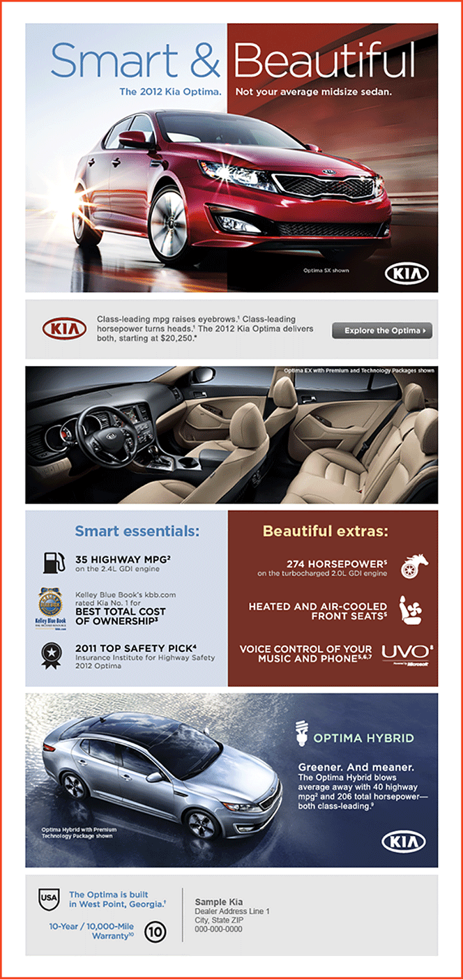
This email’s one link is prominent and commanding. But there’s both strength and weakness in its simplicity. While the single link leaves no doubt where readers should click, neither does it give any reason why they should click. Such single-mindedness would be well-suited to a strong offer that needed no explanation. But there’s no room for the subtlety that’s called for here. Without any hint of available content—or even a friendly word—“Explore the Optima” is more of an order than an invitation.
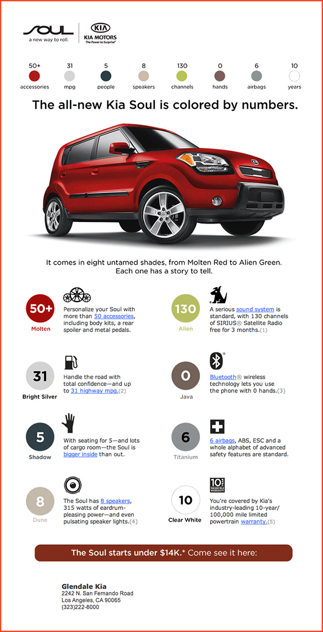
Working together, these four links are better than one. Sharing the same destination, and repeating the same call-to-action with similar words, each new variation builds on the others. Clicking slowly becomes more compelling. And with links throughout the email, readers never have to scroll far to click. Pointing to four different URLs, these same links would lead to heartbreak. Choice lowers engagement when competing calls-to-action confuse the reader, and picking one feels too much like a chore.
These eight links could be replaced by just one. A single would bring the same content to readers, without making them choose. But engagement would be likely to suffer, because this choice is more Cosmo quiz than chore. It’s a game built right into the concept. Even unclicked, these eight links send a message. A link just for speakers says the sound system is worth bragging about. The links are like stand-ins for unseen selling points, with blue underlining to help them stand out. Eight Links = One Index to deeper layers of content. They emphasize the content’s richness and the car’s quality, working together to make clicking more tempting.
⇪⇪⇪ CLICK A BUTTON OR AN IMAGE ☜☜☜ AND LET’S TALK ABOUT HYPERLINKS ▩ ▩ ▩